
There are no products listed under this category.

5 Famous Color Scheme Changes
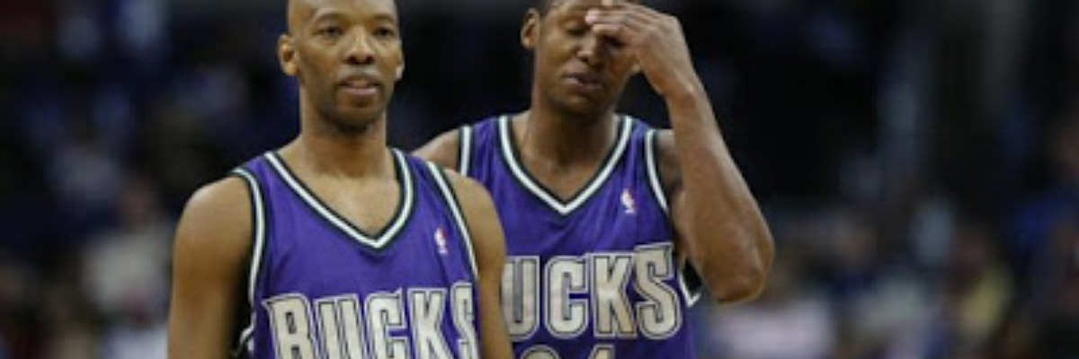
Photo credit: rollingstone.com
It was recently voted by NFL owners that the Oakland Raiders will be allowed to move to Las Vegas for the start of the 2020 season. The delay is due to a stadium being built in the desert, and that gives fans plenty of time to wonder whether the Raiders will take this opportunity to change up their color scheme to coincide with their relocation. Weâd put our money on the Raiders maintaining their classic black and silver color scheme, but it got us thinking about some times when sports teams drastically changed their colors.
 |
| Photo credit: shibevintagesports.com |
In probably the most 90s color schemes you could dream up, the Diamondbacks started play sporting a purple-pinstriped getup with a purple cap and touches of teal and gold. A World Series championship made the color combo a unique favorite among fans, but they eventually shifted to black and a brick shade of red. The initial designs of this purple-powered uniform were a bit off, but we like the color combo. Maybe Arizona will bring it back someday.
Milwaukee Bucks (Red & Green â Purple & Green)
The Bucks stormed onto the NBA scene in 1968 and became one of the quickest expansion teams to win a pro sports championship. That made their red-and-green Christmasesque uniforms a fan favorite thanks to the likes of Oscar Robertson and Lou Alcindor (now Kareem Abdul Jabbar). A few tweaks came before their drastic, ill-advised shift to purple and green, which was a look that stuck until 2006 when they took a short trip down the red and green memory lane. In 2015, they settled on a green and cream combo that blends old and new.
Washington Capitals (Red, White & Blue â Black, Gold & Teal)
If itâs not broken, donât fix it. The Capitals wore a city-appropriate combination of red, white and blue before inexplicably swapping to a very period-appropriate blend of black, gold and teal. The rise of Alex Ovechkin had fans clamoring for a look that reminded them of their glory days, and the team eventually shifted back to their old colors.
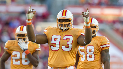 |
| Photo credit: buccaneers.com |
A color combination that reminded most of ice cream more than it did a football team, the creamsicle orange and red combination Tampa Bay used in its early days was widely hated. They shifted to red, pewter and black and ended up winning a Super Bowl. After a few tweaks, that look has stuck despite some fans clamoring for a return to their misunderstood color scheme.
Houston Astros (Navy Blue & Orange â Red & Black)
They may have taken a short detour into navy blue and gold before the full red & black takeover, but weâll consider this as one, long transition that never shouldâve happened. Navy blue and orange is nothing new, but the way the Astros utilized the colors to draw from Houstonâs NASA history was a thing of beauty. For years, a stomach-churning variety of red and black donned Houstonâs uniforms. It wasnât all bad as the team had one of its best playoff runs in the uniforms, but theyâve since seen the light and gone back to navy blue and orange.
There are definitely some big color combo changes that we left off this list (the Blue Jays dressed in black, anyone?) so weâd love to hear what you think are some of the most drastic color combination changes in pro sports. Share your thoughts with us below!